The Overlap Was in the Test, Not in the Interface
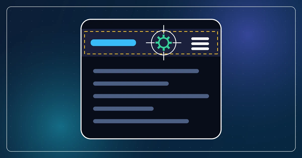
I added a small settings icon to the mobile header, next to the hamburger menu. The browser check rejected it: the new icon overlapped the hamburger.
I looked at the screen. The icon was well clear of the three bars. Nothing was on top of anything. The check was adamant.
What the test was measuring
The hamburger's click listener was attached to a full-width block, not to the three bars. Visually the bars sit at the right edge. Logically the clickable element spans the whole header row. That is a common and fine way to build a mobile header: a big easy target that happens to draw a small icon.
The test compared that element's bounding rectangle with the new icon's rectangle. A full-width block overlaps everything on its row. So the result was guaranteed before the icon was placed. It would have failed for any icon, anywhere in the header, including one with a hundred pixels of clear space around it.
My assistant's first instinct was to change the header to satisfy the test. Shrink the hamburger's hit area, or move the icon out of the row. Both would have made the working header worse to fix a problem that did not exist.
Three different claims
The check conflated three things that only sometimes agree:
Geometric intersection. Do the two elements' rectangles overlap? Cheap to compute, and almost meaningless on its own, because rectangles are bigger than the things they contain and layouts stack on purpose.
Visible collision. Does one drawn thing sit on top of another drawn thing, so a person sees them clash? This is what I was checking with my eyes, and the answer was no.
Pointer interception. When a user taps the center of the new icon, which element receives the tap? This is the one that matters for reachability, and it is the only one that answers "can the user press the button".
The test was computing the first and reporting it as the third.
What we checked instead
Rather than touch the CSS, I had the assistant measure the actual bars, not the block that holds them, and confirm the icon cleared them. Then hit-test the center of the icon: ask the browser which element is topmost at that point. The icon. Then do it again with the drawer open, because that is when headers get rearranged. Still the icon.
The full-width block was behind the icon, in stacking order, exactly as the layout intended. The user would get the gear when they tapped the gear. The test was the only thing that thought otherwise.
Two checks, each a few lines, and the header stayed as it was.
Test the claim the user would experience
The lesson generalizes past headers. When a check fails, ask what claim it is actually testing, and whether that claim is the one you care about. A bounding-box overlap says nothing about whether a control is reachable. A reachability failure says nothing about whether the layout looks wrong.
For layout, inspect the visible children. For reachability, hit-test. For "does it look right", look at it. Pick the measurement that matches the question, and be suspicious of any check that would fail on an interface you can see is fine.
And when the assistant proposes changing the product to make a test pass, stop and ask which of the two is wrong. Sometimes it is the product. This time the overlap was in the test.